Clean, reshape, and manipulate real-world data using {dplyr} and {tidyr}
Integrate tidy data into downstream analysis (e.g., for visualization or statistical analysis)
Install {tidyverse} and Load the Package
# install.packages("tidyverse")library(tidyverse)
── Attaching core tidyverse packages ──────────────────────── tidyverse 2.0.0 ──
✔ dplyr     1.1.4     ✔ readr     2.1.5
✔ forcats   1.0.0     ✔ stringr   1.5.1
✔ ggplot2   3.5.1     ✔ tibble    3.2.1
✔ lubridate 1.9.4     ✔ tidyr     1.3.1
✔ purrr     1.0.4
── Conflicts ────────────────────────────────────────── tidyverse_conflicts() ──
✖ dplyr::filter() masks stats::filter()
✖ dplyr::lag()    masks stats::lag()
ℹ Use the conflicted package (<http://conflicted.r-lib.org/>) to force all conflicts to become errors
Mini Data Project
This mini data project is based on a real project that focuses on gene expression across different time points.
A researcher has measured the expression levels of 20 genes (anonymed as 1 to 20) using the RT-qPCR technique. The gene expression was assessed in two structures of the mouse brain. Mice ranged in age from 10 to 60 days (10, 15, 20, 25, 30, 35, 40, 45, 50, 60 days), and the experiment was repeated with both male and female mice, with 6 animals (named from A to F) in each group.
According to the researcher, the data was stored in two files, one for each brain structure. Within each file, rows represent the different ages, and columns represent the gene, sex, and animal.
A small Gaussian noise has been added to the original data, preserving the overall structure.
We will focus on the data from the brain structure 1.
Import the Data
Please download the data_anonym_struc1_noise.csv file. Observe your data file:
Is there a header line?
What is the separator between columns?
Which character was used for decimal points?
Which character was used for missing data (between two seperators where there’s no value)?
Preview File
You can preview the data file in different ways, such as:
Opening it with a text editor;
Clicking the file name and selecting “View File” in the RStudio File Pane;
Or by using the terminal: head -n2 data_anonym_struc1_noise.csv (to view the first 2 lines) or more data_anonym_struc1_noise.csv (to scroll through the file and quit by typing q), which is recommended for large files.
Import the data_anonym_struc1_noise.csv into RStudio, you can use either:
the read_csv2() from the package {readr} (?readr::read_csv2), or
use the click-button way and copy-paste the code in your script.
Don’t forget to use/select the appropriate parameters to make sure you import correctly the data.
Name the data as data1. Convert your imported data to tibble format if it’s not the case.
New names:
Rows: 10 Columns: 241
── Column specification
──────────────────────────────────────────────────────── Delimiter: ";" dbl
(241): ...1, 1MA, 1MB, 1MC, 1MD, 1ME, 1MF, 2MA, 2MB, 2MC, 2MD, 2ME, 2MF,...
ℹ Use `spec()` to retrieve the full column specification for this data. ℹ
Specify the column types or set `show_col_types = FALSE` to quiet this message.
• `` -> `...1`
# or use the read_delim() with appropriate parameters# data1 <- read_delim(# "../exos_data/data_anonym_struc1_noise.csv", # delim = ";", locale = locale(decimal_mark = ",")# )
Reshape data to “tidy” format with the pivot_longer() function. (tidy format: each variable is a column, each observation is a row.) What are the columns to be included to pivot into longer format?
# A tibble: 106 × 6
     age gene_id sex   animal value struc
   <dbl> <chr>   <chr> <chr>  <dbl> <chr>
 1    10 1       M     A      1.93  s1
 2    10 1       M     B      0.413 s1
 3    10 1       M     C      1.21  s1
 4    10 1       M     D      1.40  s1
 5    10 1       M     E      1.02  s1
 6    10 1       M     F      0.795 s1
 7    10 1       F     A      2.93  s1
 8    10 1       F     B      1.47  s1
 9    10 1       F     C      2.44  s1
10    10 1       F     D      2.71  s1
# ℹ 96 more rows
After removing NAs, how many animals are there for each sex in gene 1?
# A tibble: 2 × 4
  sex   median_gene1 mean_gene1 sd_gene1
  <chr>        <dbl>      <dbl>    <dbl>
1 F             1.21       1.37    0.639
2 M             1.09       1.11    0.488
Explore the Data
What kind of analysis would you like to perform with this data?
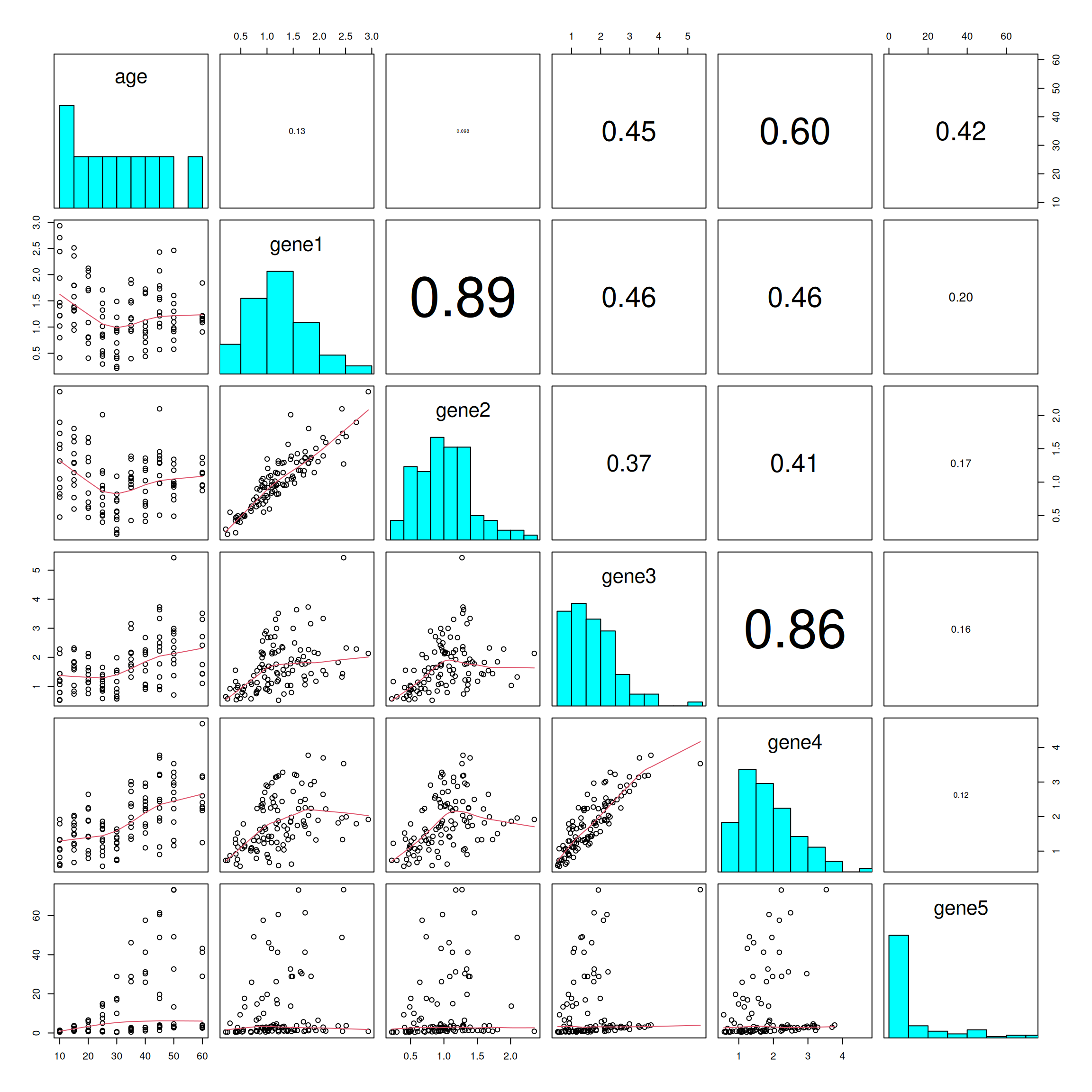
In statistics, it’s common to begin by exploring the dataset as a whole and visualizing the relationships between different variables. The basic R function pairs() (?pairs) is useful for creating a matrix of scatter plots to examine the relationships between each pair of continuous variables.
For instance, we can explore the relationships between continuous variables such as age and the expression levels of genes 1, 2, 3, etc.
How will you reshape the data1_long to provide the necessary data for the pairs() function?
data1_wider <- data1_long |>pivot_wider(names_from ="gene_id",values_from ="value",names_prefix ="gene"# to avoid name starts with number )data1_wider
# A tibble: 120 × 24
     age sex   animal struc gene1 gene2 gene3 gene4  gene5  gene6  gene7  gene8
   <dbl> <chr> <chr>  <chr> <dbl> <dbl> <dbl> <dbl>  <dbl>  <dbl>  <dbl>  <dbl>
 1    10 M     A      s1    1.93  1.51  1.18  1.32   1.22   0.916  1.11   1.12
 2    10 M     B      s1    0.413 0.476 0.539 0.624  0.418  0.426  0.718  0.806
 3    10 M     C      s1    1.21  1.32  1.22  1.07   1.38   1.28   0.829  1.10
 4    10 M     D      s1    1.40  1.57  1.44  1.33   1.33   1.65   1.33   1.15
 5    10 M     E      s1    1.02  0.918 1.06  0.816  0.848  1.47   1.13   0.941
 6    10 M     F      s1    0.795 0.775 0.788 1.04   1.15   0.945  1.03   0.906
 7    10 F     A      s1    2.93  2.36  2.13  1.92   0.846  1.93   1.38   0.532
 8    10 F     B      s1    1.47  1.05  0.788 0.623  0.803  0.921  1.45   0.693
 9    10 F     C      s1    2.44  1.73  1.44  1.33   0.892  2.87   1.88   0.646
10    10 F     D      s1    2.71  1.90  2.28  1.79  NA     NA     NA     NA
# ℹ 110 more rows
# ℹ 12 more variables: gene9 <dbl>, gene10 <dbl>, gene11 <dbl>, gene12 <dbl>,
#   gene13 <dbl>, gene14 <dbl>, gene15 <dbl>, gene16 <dbl>, gene17 <dbl>,
#   gene18 <dbl>, gene19 <dbl>, gene20 <dbl>
To save space, we will focus on examining the relationship between age and the first 5 genes.
What did you observe from these scatter plots?
## put histograms on the diagonalpanel.hist <-function(x, ...) { usr <-par("usr")par(usr =c(usr[1:2], 0, 1.5) ) h <-hist(x, plot =FALSE) breaks <- h$breaks; nB <-length(breaks) y <- h$counts; y <- y/max(y)rect(breaks[-nB], 0, breaks[-1], y, col ="cyan", ...)}## put (absolute) correlations on the upper panels,## with size proportional to the correlations.panel.cor <-function(x, y, digits =2, prefix ="", cex.cor, ...) {par(usr =c(0, 1, 0, 1)) r <-abs(cor(x, y, use ="na.or.complete")) # modified to allow NA txt <-format(c(r, 0.123456789), digits = digits)[1] txt <-paste0(prefix, txt)if(missing(cex.cor)) cex.cor <-0.8/strwidth(txt)text(0.5, 0.5, txt, cex = cex.cor * r)}pairs(x =select(data1_wider, age, gene1:gene5),diag.panel = panel.hist,lower.panel = panel.smooth,upper.panel = panel.cor)
Calculate the correlation between gene 1 and 2. (?cor)
cor(x = data1_wider$gene1,y = data1_wider$gene2,use ="na.or.complet") # by default use the pearson's method
[1] 0.8935659
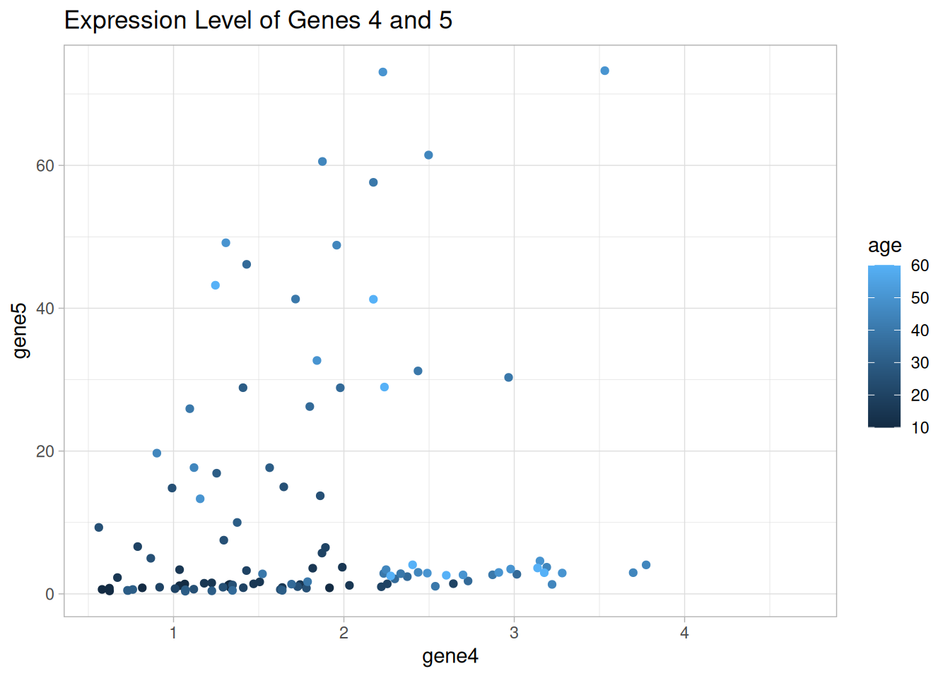
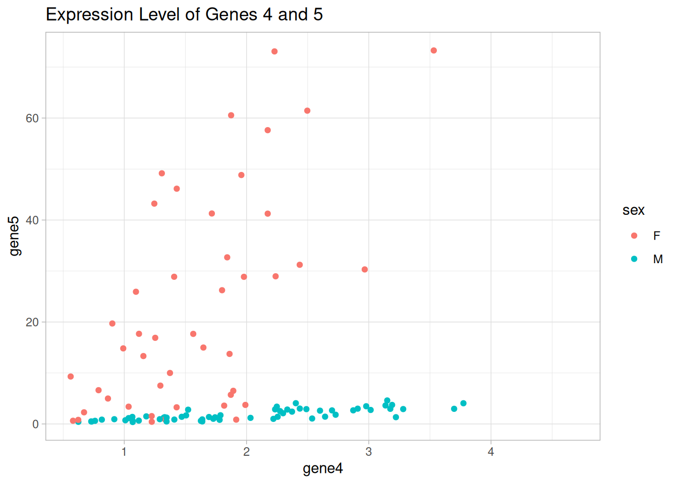
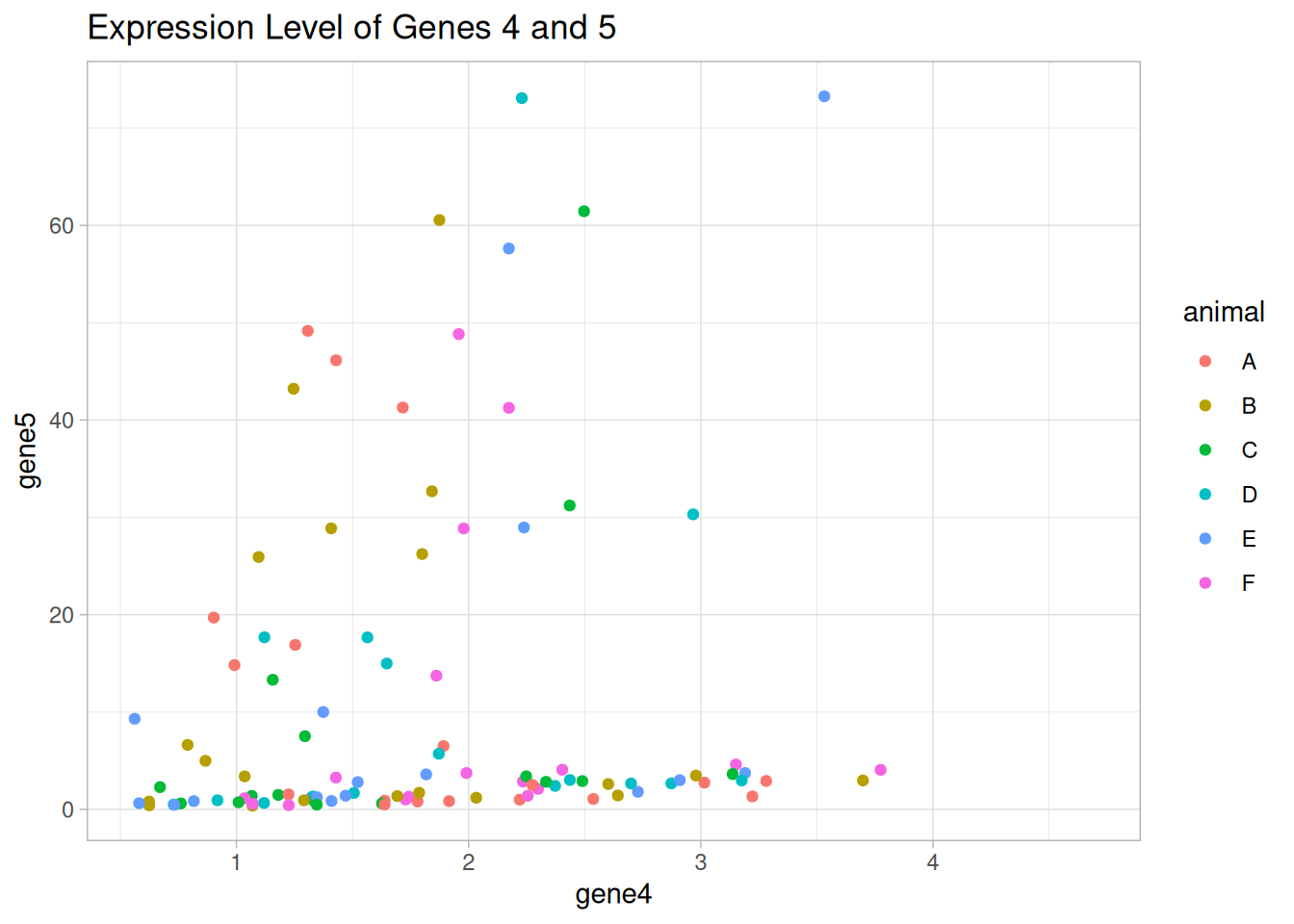
It seems that there are two groups of mice that express genes 4 and 5 in a similar way.
Draw a scatter plot using {ggplot2} to show the expression levels of genes 4 and 5. Color the points by different categorical variables that we have, i.e., age, sex, and animal.
Is there any categorical variable that can explain the groups we observed in the figure?
p_age <-ggplot(data = data1_wider, aes(x = gene4, y = gene5)) +geom_point(aes(color = age)) +labs(title ="Expression Level of Genes 4 and 5") +theme_light()p_age
Warning: Removed 16 rows containing missing values or values outside the scale range
(`geom_point()`).
p_sex <-ggplot(data = data1_wider, aes(x = gene4, y = gene5)) +geom_point(aes(color = sex)) +labs(title ="Expression Level of Genes 4 and 5") +theme_light()p_sex
Warning: Removed 16 rows containing missing values or values outside the scale range
(`geom_point()`).
p_animal <-ggplot(data = data1_wider, aes(x = gene4, y = gene5)) +geom_point(aes(color = animal)) +labs(title ="Expression Level of Genes 4 and 5") +theme_light()p_animal
Warning: Removed 16 rows containing missing values or values outside the scale range
(`geom_point()`).
Bonus
Use the read.table() function to import the data and continue to reshape the data based on the imported data.
(Check the approporiate parameters to be included with ?read.table)
Correction
# import data with the basic functiondata1 <-read.table(file ="../exos_data/data_anonym_struc1_noise.csv",header =TRUE, sep =";", dec =",", na.strings ="")# convert to a tibbledata1 <-as_tibble(data1)# transform to long format and data_long <- data1 |>rename(age = X) |>pivot_longer(cols =-1, names_to ="id", values_to ="value") |>mutate(id =sub("X", "", id), # remove the X in IDstruc =paste0("s", 1) # store info of brain structure ) |>extract( # extract column into multiple columns id,into =c("gene_id", "sex", "animal"),regex ="([0-9]+)([MF])([A-F])" )data_long
# A tibble: 2,400 × 6
     age gene_id sex   animal value struc
   <int> <chr>   <chr> <chr>  <dbl> <chr>
 1    10 1       M     A      1.93  s1
 2    10 1       M     B      0.413 s1
 3    10 1       M     C      1.21  s1
 4    10 1       M     D      1.40  s1
 5    10 1       M     E      1.02  s1
 6    10 1       M     F      0.795 s1
 7    10 2       M     A      1.51  s1
 8    10 2       M     B      0.476 s1
 9    10 2       M     C      1.32  s1
10    10 2       M     D      1.57  s1
# ℹ 2,390 more rows
Good job! 👏👏 You’ve made great progress in mastering data manipulation techniques.