Warning in mean.default(counts["gene3", ]): argument is not numeric or logical:
returning NA
[1] NA
Correction
mean(unlist(counts["gene3", ]))
[1] 2.666667
Correction
# ormean(as.matrix(counts)["gene3", ])
[1] 2.666667
Fix error in condition.
x <-10if (x =5) {print("x is 5")}
Error in parse(text = input): <text>:2:7: unexpected '='
1: x <- 10
2: if (x =
         ^
Correction
x <-10if (x ==5) {print("x is 5")}
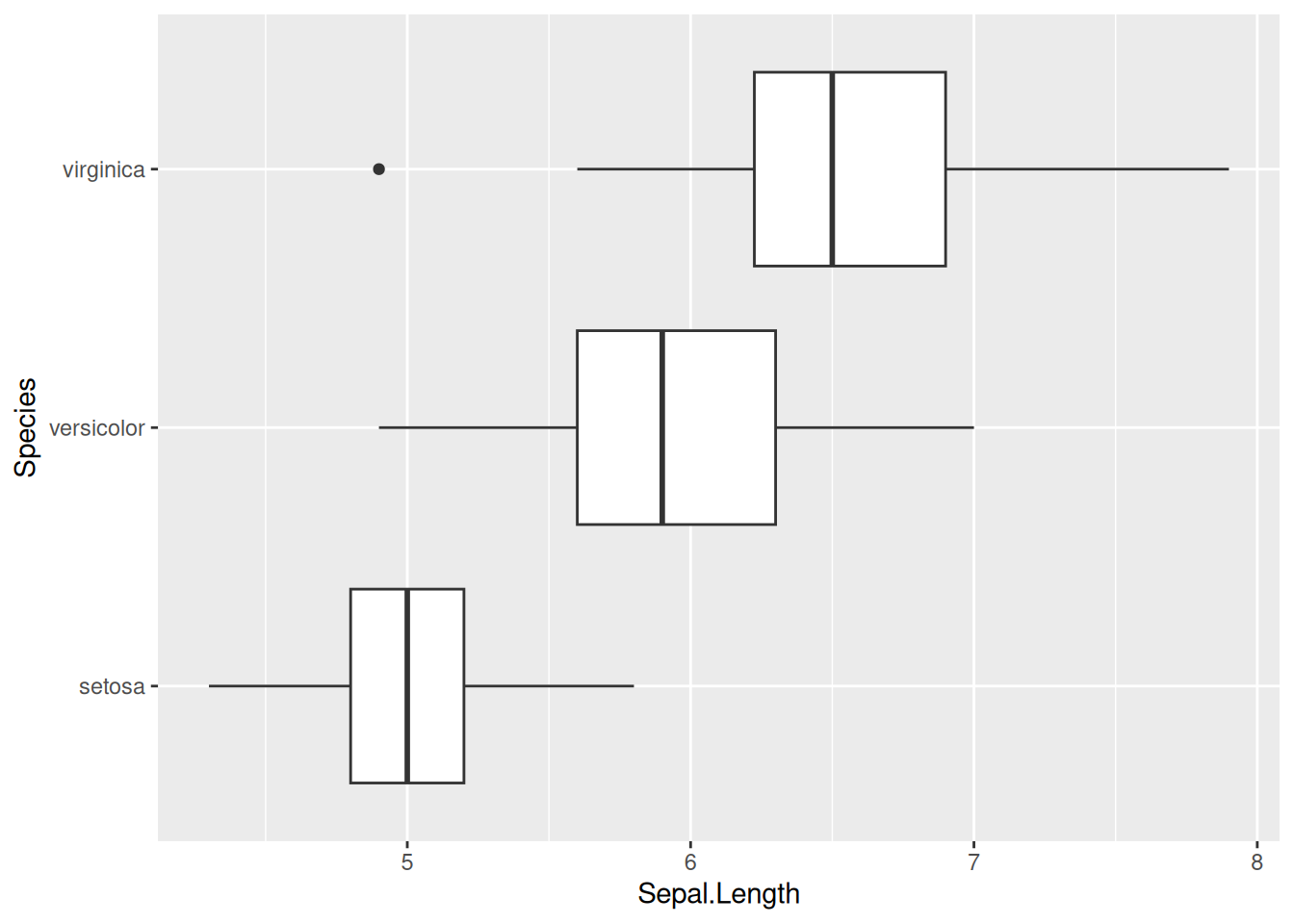
Fix error in ggplot2. The goal is to show petal length with a boxplot for each species.
ggplot(iris, aes(x = Sepal.Length, y = Species))geom_boxplot()
Error in ggplot(iris, aes(x = Sepal.Length, y = Species)): could not find function "ggplot"
Error in geom_boxplot(): could not find function "geom_boxplot"
Correction
library(ggplot2) # load the package before useggplot(iris, aes(x = Sepal.Length, y = Species)) +# need "+" between layersgeom_boxplot()
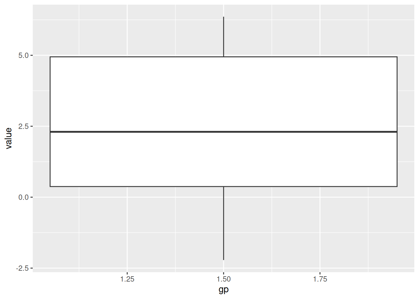
Fix error in ggplot2. The aim is to draw boxplot for each group.
# simulate data for two groups of samples.set.seed(1)data <-data.frame(gp =rep(1:2, each =20),value =c(rnorm(20), rnorm(20, mean =5)))str(data)
'data.frame':   40 obs. of  2 variables:
 $ gp   : int  1 1 1 1 1 1 1 1 1 1 ...
 $ value: num  -0.626 0.184 -0.836 1.595 0.33 ...
# draw boxplot by group.ggplot(data, aes(x = gp, y = value)) +geom_boxplot()
Warning: Continuous x aesthetic
ℹ did you forget `aes(group = ...)`?
Correction
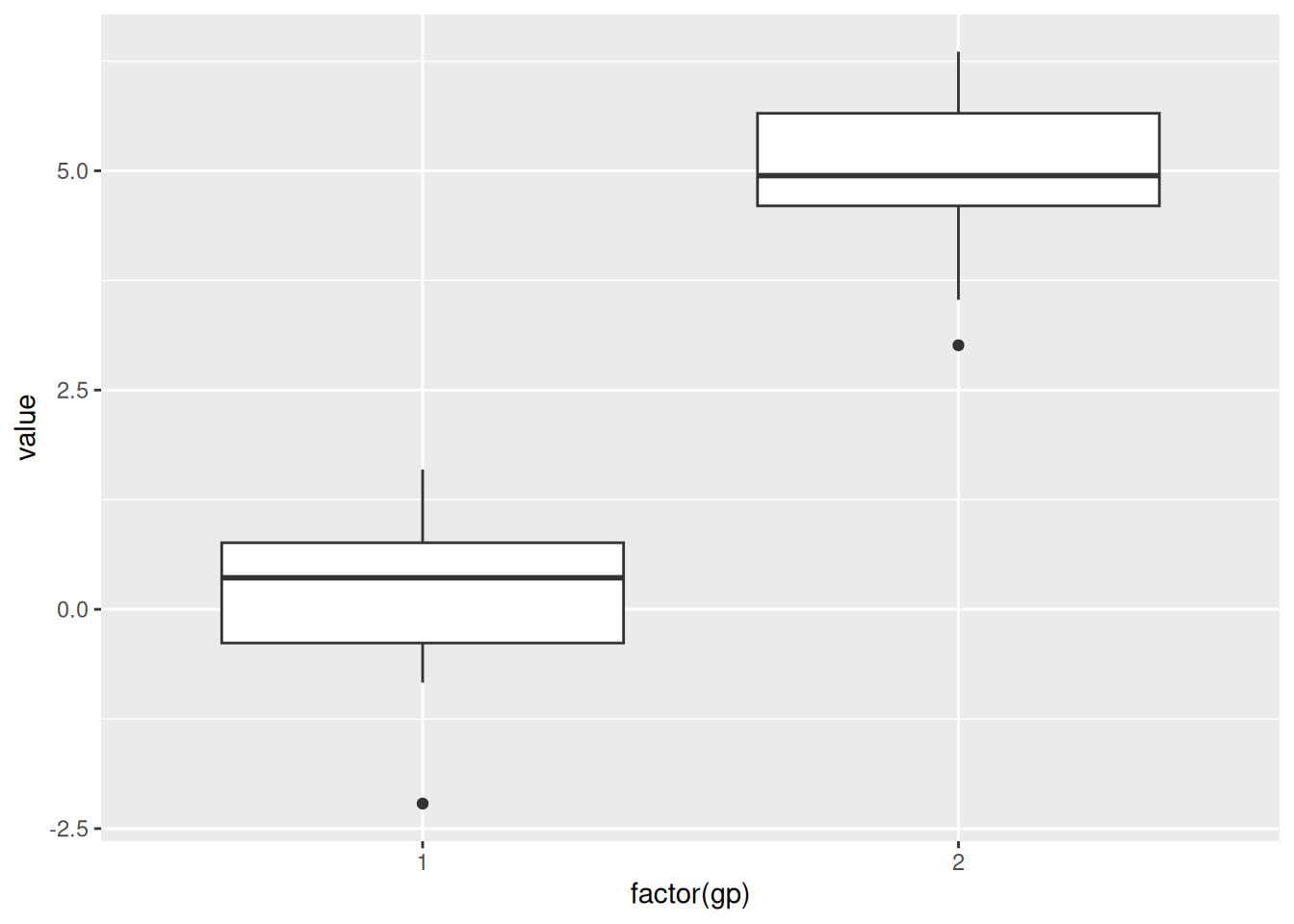
ggplot(data, aes(x =factor(gp), y = value)) +geom_boxplot()
Fix code in data filtration.
# try to keep rows where the value is smaller than -0.5data[data$value<-0.5, ]
[1] gp    value
<0 rows> (or 0-length row.names)
Correction
str(data) # the original data was changed!
'data.frame':   40 obs. of  2 variables:
 $ gp   : int  1 1 1 1 1 1 1 1 1 1 ...
 $ value: num  0.5 0.5 0.5 0.5 0.5 0.5 0.5 0.5 0.5 0.5 ...
Correction
# rebuild the data frameset.seed(1)data <-data.frame(gp =rep(1:2, each =20),value =c(rnorm(20), rnorm(20, mean =5)))data[data$value <-0.5, ]
   gp      value
1   1 -0.6264538
3   1 -0.8356286
6   1 -0.8204684
13  1 -0.6212406
14  1 -2.2146999
Mini Data Project
A researcher has collected some gene expression data from 12 samples. However, some expression values are missing. Please help the researcher to clean the data and to performs some basic analyses.
# Simulated dataset with missing valuesdata <-data.frame(sample_id =paste0("sample", 1:12),expression =c(10.2, 15.2, NA, NA, 9.4, 18.1,8.9, 16.0, 10.5, 15.5, 11.5, 13.4 ),sample_group =rep(c("Control", "Case"), times =6))# Show the datasetdata
   sample_id expression sample_group
1    sample1       10.2      Control
2    sample2       15.2         Case
3    sample3         NA      Control
4    sample4         NA         Case
5    sample5        9.4      Control
6    sample6       18.1         Case
7    sample7        8.9      Control
8    sample8       16.0         Case
9    sample9       10.5      Control
10  sample10       15.5         Case
11  sample11       11.5      Control
12  sample12       13.4         Case
Tasks:
Find missing values. Which rows contain missing values? → Hint: Use is.na()
Correction
# Check which values are missingis.na(data$expression)
# Show only rows with missing valuesdata[is.na(data$expression), ]
  sample_id expression sample_group
3   sample3         NA      Control
4   sample4         NA         Case
Correction
## or find the index of NAswhich(is.na(data$expression))
[1] 3 4
Correction
data[which(is.na(data$expression)), ]
  sample_id expression sample_group
3   sample3         NA      Control
4   sample4         NA         Case
Remove rows with missing values. Create a new dataset without missing values.
Correction
# Remove rows where expression is NAdata_clean <- data[!is.na(data$expression), ]# Show the cleaned datasetdata_clean
   sample_id expression sample_group
1    sample1       10.2      Control
2    sample2       15.2         Case
5    sample5        9.4      Control
6    sample6       18.1         Case
7    sample7        8.9      Control
8    sample8       16.0         Case
9    sample9       10.5      Control
10  sample10       15.5         Case
11  sample11       11.5      Control
12  sample12       13.4         Case
Basic summary statistics
What is the mean expression level (after removing missing values)?
Use data_clean to draw a graph you have already seen, e.g.: box plots, scatter plots, etc.
Correction
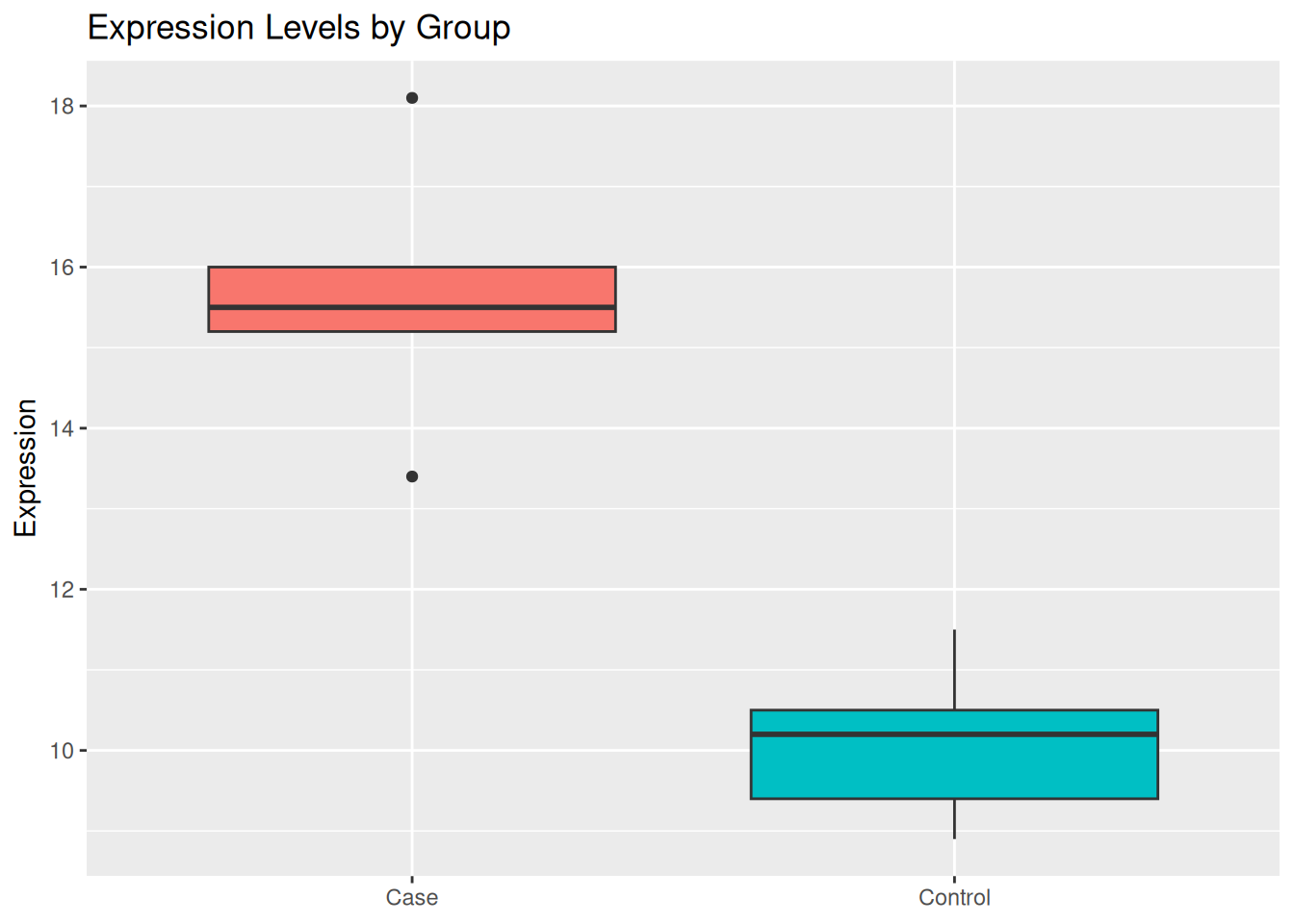
## a boxplot to show if "Case" has higher/lower expression than "Control."ggplot( data_clean,aes(x = sample_group, y = expression, fill = sample_group)) +geom_boxplot() +labs(title ="Expression Levels by Group",x =NULL,y ="Expression" ) +theme(legend.position ="none")
Correction
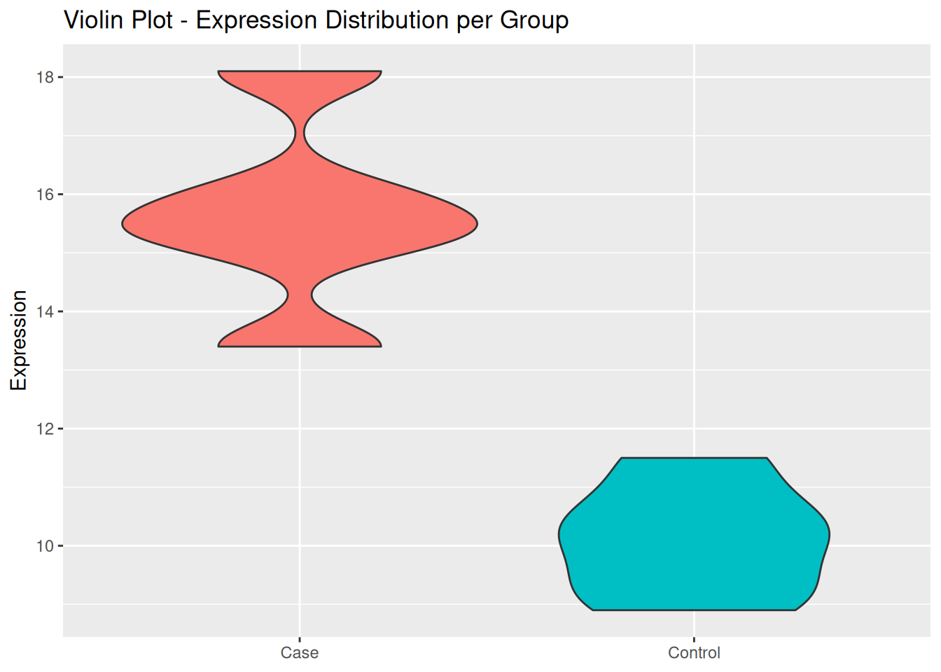
## Violin plot to show variability and density of expression levelsggplot( data_clean,aes(x = sample_group, y = expression, fill = sample_group)) +geom_violin() +labs(title ="Violin Plot - Expression Distribution per Group",x =NULL,y ="Expression" ) +theme(legend.position ="none")
Correction
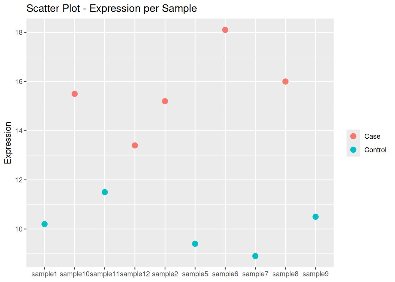
## Spotting individual variationsggplot( data_clean,aes(x = sample_id, y = expression, color = sample_group)) +geom_point(size =3) +labs(title ="Scatter Plot - Expression per Sample",x =NULL,y ="Expression",color =NULL )
Correction
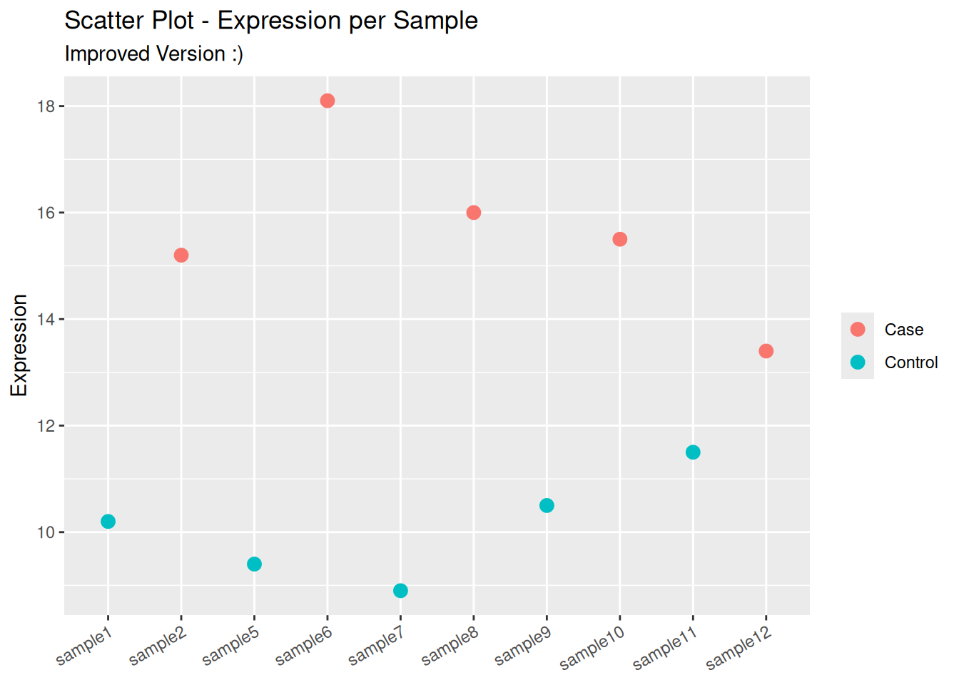
## better solutionggplot( data_clean,aes(# recode variable as factor with the wanted orderx =factor(sample_id, levels = sample_id),y = expression,color = sample_group )) +geom_point(size =3) +labs(title ="Scatter Plot - Expression per Sample",subtitle ="Improved Version :)",x =NULL,y ="Expression",color =NULL ) +theme(# rotate x-axis' text to avoid overlapaxis.text.x =element_text(angle =30, hjust =1) )
To go futhur: Let’s visualise the average expression of each group using barplot, with the help of ChatGPT (or any other AI tool).
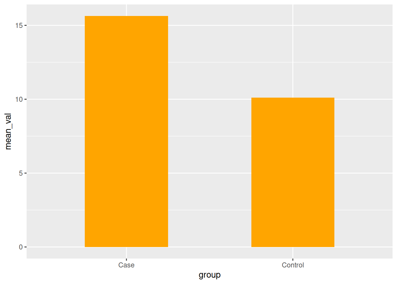
6a. Prepare data for barplot with error bars. We need to reorganize the data in a dataframe with 2 rows and 3 columns:
the column group contain the name of each group
the column mean contain the mean expression in of each group
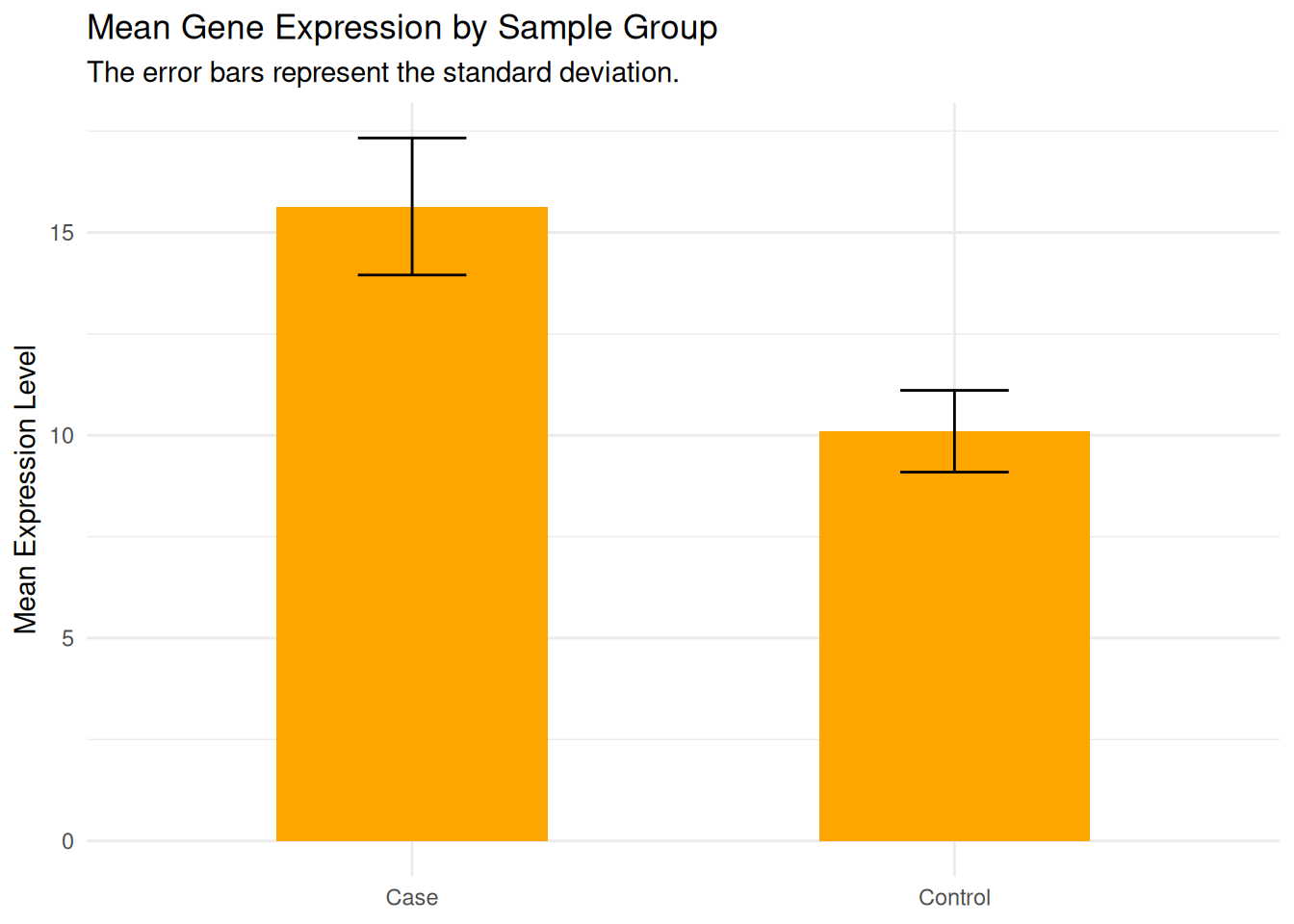
    group mean_val   sd_val
1 Control    10.10 1.007472
2    Case    15.64 1.689083
6b. Draw the bar plot:
Plot bars for mean expression (geom_bar(stat = "identity"))
Add error bars for standard deviation (geom_errorbar())
Change the aesthetic apsects as you want, e.g.: color, title, legend, etc.
Correction
p_bar <-ggplot(data = gg_data, aes(x = group, y = mean_val)) +geom_bar(stat ="identity", fill ="orange", width =0.5) # bar plotp_bar
Correction
p_bar_error <- p_bar +geom_errorbar( # add errorbaraes(ymin = mean_val - sd_val, ymax = mean_val + sd_val ), width =0.2# smaller width of error bar )# change labels and themep_bar_error +labs(title ="Mean Gene Expression by Sample Group",subtitle ="The error bars represent the standard deviation.",x =NULL, y ="Mean Expression Level" ) +theme_minimal()
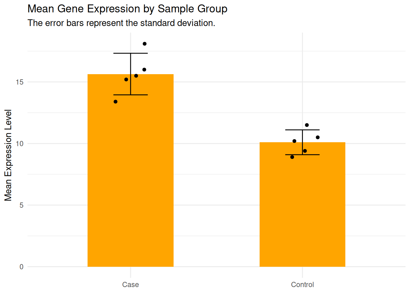
6c: What if we want to add the expression level of each sample to the bar plot?
Hint: Add another layer for drawing points (geom_point), using the data frame that contains the individual data (data_clean).
Correction
# change labels and themep_bar_error +labs(title ="Mean Gene Expression by Sample Group",subtitle ="The error bars represent the standard deviation.",x =NULL, y ="Mean Expression Level" ) +theme_minimal() +geom_point( # add the layer of pointsdata = data_clean, # use the individual dataaes(x = sample_group, y = expression), # map axesposition =position_jitter( # add random noise to avoid overlap between pointswidth =0.1, height =0, # allow the points to be spread across a small horizontal range (width = 0.1),# while keeping the value on y-axis fixed (height = 0)seed =1 ) )
Good job! 👏👏 You’ve taken your first big steps into R, and you’re off to a great start, keep it up!